");float:right;margin:5px 10px 0px 0px}.eleven #ez-toc-container .ez-toc-toggle label, .eleven #ez-toc-container label.cssicon, .eleven #ez-toc-widget-container label.cssicon{position:absolute;font-size:16px;padding:0;border:0px;border-radius:5px;cursor:pointer;width:100%;height:37px;top:0px;left:0px}.eleven div#ez-toc-container p.ez-toc-title{display:unset}a.dem-results-link{font-weight:400 !important;color:#ff4e50 !important}input[type="submit"].dem-button,button[type="button"].dem-button{border-radius:3px !important;font-size:90% !important;font-weight:bold !important;font-family:unset !important;padding:0.5em 1.6em !important;text-transform:unset !important;float:right !important}section.blog .blog_post .post_content a.dem-results-link{font-weight:unset !important;color:#ff4e50 !important}section.blog .blog_post .post_content a.dem-results-link:hover{text-decoration:underline}@media only screen and (max-width: 767px){.author_info .info{width:100% !important}.author_info .image{width:0 !important;width:75px;margin-bottom:17px}.author_info .info h4, .author_info .info .about{padding-left:0px !important;padding-right:0px !important}section.blog .blog_post footer{padding:10px 15px !important}}.author_info .info{padding-bottom:25px}.author_info_env{padding:0 !important}.info h4 a:hover{color:#ff4e50}.author_info .image img{border-radius:900px;padding:0px}.jumpto{border:solid 2px #ff4e50;border-radius:5px;width:max-content;text-transform:uppercase;font-size:14px;font-weight:700;color:#ff4e50;margin-bottom:30px;margin-top:35px;overflow:unset !important}.jumpto:hover{background-color:#ff4e50}.jumpto a{display:inline-block;width:100%;height:100%;padding:5px 10px;color:#ff4e50}.jumpto a:hover{color:#fff !important}section.header_nav .logo{width:300px}@media only screen and (max-width: 767px){section.blog .blog_post header .featured_image{margin-bottom:25px}}div.feature-credit{font-weight:normal;font-size: .7em;padding-left:16px;background:url(/wp-content/camera.svg) no-repeat left top;line-height:10px;margin-top:7px;color:#ff4e50}footer.footer_section{background:#fff;padding:20px;border-bottom:1px solid #f0f0f0;border-top:solid 5px #ff4e50 !important;clear:both}footer.footer_widgets{margin-top:15px}footer.footer_widgets .four.columns{width:100% !important}footer.footer_section .about_us{padding-top:30px;padding-bottom:30px}footer.footer_section .about_us h4{font-size:16px;padding-bottom:10px;color:#000;font-weight:bold}footer.footer_section .about_us p{font-size:16px;color:#000;line-height:24px}footer.main_footer{margin:0;padding:30px 0}footer.main_footer .row{padding:0px}footer.main_footer ul li{display:block;float:left;font-size:14px;margin-right:30px;color:#444}footer.main_footer ul li a{color:#444;font-weight:bold;line-height:26px}footer.main_footer ul li a:hover{color:#ff4e50}footer.footer_widgets{border-top:solid 5px #ff4e50 !important}.container .four.columns{width:100%;max-width:450px}.footer_widgets p{line-height:1.4 !important}.post_content h4 a, .post_content h3 a{background-image:linear-gradient(transparent 85%,#ff4e50 0)}section.blog .blog_post .excerpt h1, section.blog .blog_post .post_content h1{border-left:solid 5px #ff4e50;margin-left:-10px;padding-left:5px}section.blog .blog_post .excerpt h3, section.blog .blog_post .post_content h3, section.blog .blog_post .excerpt h2, section.blog .blog_post .post_content h2, section.blog .blog_post .post_content h2 strong, section.blog .blog_post .post_content h2 b, section.blog .blog_post .post_content h3 strong, section.blog .blog_post .post_content h3 b{border-left:solid 30px #ff4e50;margin-left:-40px;padding-left:10px;margin-top:50px;margin-bottom:30px;font-weight:800}h3.adthrive-player-title{margin-top:0px !important}section.blog .blog_post .excerpt h4, section.blog .blog_post .post_content h4{border-left:solid 30px #ff4e50;margin-left:-40px;padding-left:10px;margin-top:50px;font-size:22px;margin-bottom:20px}section.blog .blog_post header .featured_image{margin-bottom:50px}section.blog .blog_post .excerpt a:hover, section.blog .blog_post .post_content a:hover{color:#ff4e50}section.blog.has_sidebar .blog_post{margin-bottom:20px}section.blog .blog_post .excerpt p a, section.blog .blog_post .post_content p a, section.blog .blog_post .post_content li a{color:#000;font-weight:bold}.noBorder{border:0px !important;background-image:unset !important}.post_content .wp-caption-text{font-size:14px}legend{font-weight:700;font-size:24px}fieldset{border:1px solid #ff4e50;padding:20px 20px 0px 20px;border-radius:5px;color:#ff4e50;margin:30px 0px}.post_content ul li{list-style-type:none}.lazyload,.lazyloading{opacity:1 !important;background:#ececec}.img-with-border{border:1px solid #c3c3c3;padding:10px}section.blog .blog_post .excerpt blockquote, section.blog .blog_post .post_content blockquote{border-left:solid 4px #ff4e50;font-style:italic;padding:15px;margin:40px 20px;background-color:#ffe8e8}#scroll_top_arrow{position:fixed;bottom:120px;background:#ff4e50;right:0px;width:70px;height:50px;border-radius:15px 0px 0px 15px;text-decoration:none;fill:#fff;text-align:center;line-height:47px;display:none}#scroll_top_arrow svg{vertical-align:middle;height:25px;width:25px}@media screen and ( min-width: 767px ){#scroll_top_arrow{display:none !important}}.byuser>.comment-body>.comment-author>.fn::before{display:inherit;content:"CGDIRECTOR";padding:1px 7px;margin-right:10px;border-radius:5px;font-weight:800;font-size:8px;top:6px;letter-spacing:0.1em;position:relative;border:solid 2px #ff4e50;float:left}section#comments{padding-top:30px;padding-bottom:40px;border-top:solid 2px #ff4e50}li.comment{list-style:none;margin-bottom:25px;padding-bottom:25px}.children li.comment{border-bottom:none;margin-bottom:5px;padding-bottom:0px}.comments_list .comment ul.children{padding:15px 0px 0px 40px}.comments .btn, .comment-reply-link, .comments .submit, .btn-more, small a{border-radius:8px;padding:15px;border:#ff4e50 solid 2px;color:#ff4e50;background:#fff;display:inline-block;cursor:pointer}small a{float:right;margin-bottom:20px;margin-left:20px}.reply{margin-top:35px}.comment .fn{font-weight:800;font-style:unset;font-size:20px}.comment-meta{font-size:14px;margin-bottom:15px}.comment-body{padding:15px 25px 25px 25px;border-top:1px solid #dedede;line-height:1.5;font-size:16px}.byuser>.comment-body{background:#fff6f6;border-left:2px solid #ff4e50;border-top:none}.byuser>.comment-body>.comment-author>.fn{color:#ff4e50}section.comments_form{margin-bottom:50px;border-bottom:solid 2px #ff4e50;padding-bottom:25px}.comments textarea{width:100%;height:100px}.comments input{width:100%;max-width:300px}.comments{font-size:16px}.comment-form-author input, .comment-form-email input{height:40px}.form-submit{margin-top:35px}.commentpolicy{line-height:1.25;font-size:18px}.comment-reply-title{margin-top:20px}@media only screen and (max-width: 450px){.header_subline .date img{display:none}.header_subline span.updated, .header_subline span.published{display:none}}@media only screen and (max-width: 360px){section.header_nav .custom_logo_image .logo_image svg{width:220px;min-height:61px}}@media only screen and (min-width: 361px) and (max-width: 540px){section.header_nav .custom_logo_image .logo_image svg{width:250px;min-height:61px}}section.blog .blog_post header .featured_image img{border-bottom:solid 5px #ff4e50}@media only screen and (max-width: 767px){.header_content{padding:0px 15px 0px 15px}}.header_subline{margin:0px 0 20px 0;padding:0 0 7px 0;display:inline-block}.header_comments_link{font-weight:bold;padding:0px}.header_content h1.title.withcomments{width:calc(100% - 59px);float:left;padding-right:10px;border-right:solid 3px #ff4e50}.header_content h1.title{width:100%;float:left}.affiliate{margin:40px 0px;font-weight:bold;line-height:1.0;padding:10px;color:#333;font-size:18px;display:block;background:#ffe8e8;border-radius:10px}section.blog .blog_post header .date a{color:#ff4e50}section.blog .blog_post header{text-align:left}section.blog .blog_post header .date{border-top:0px;padding:0px;display:inline-block;margin-bottom:0px;margin-top:0px;font-weight:bold}.date span{position:relative;height:24px;font-size:16px;padding:0px}iframe.pcbuilder-embedd{min-height:760px}.postid-5266 section.blog .blog_post header .featured_image, .postid-5266 .header_subline, .postid-5266 .dpsp-shortcode-wrapper{display:none}#fixed_ad_container_420{height:480px;overflow:hidden}@media only screen and (max-width: 767px){#fixed_ad_container_420{height:0px !important}}#AdThrive_Sidebar_1_desktop{min-height:420px}div#AdThrive_Sidebar_1_desktop>div{position:sticky;top:0}.adthrive-content{border-top:1px #ddd solid;border-bottom:1px #ddd solid;margin:40px 0px !important;padding:15px 0px}.adthrive-ad-cls{align-items:unset !important}.adthrive-ad-cls>div,.adthrive-ad-cls>iframe{position:sticky;top:0px;height:fit-content}.adthrive-content::before{content:"Advertisement";color:#868686;font-size:12px;position:absolute;right:24px;background:#fff;align-self:baseline;width:93px;height:15px;margin-top:-24px;padding-top:7px}.code-block{overflow:hidden;text-align:center}div.adthrive-collapse-player{width:100% !important;padding:10px 0px 0px 0px !important;margin-bottom:20px}.sticky-note-sidebar-container{margin-top:42px;margin-bottom:-20px !important}.sidebar .sticky-note{display:block;border:3px solid #ff4e50;padding:20px;margin-top:38px;margin-bottom:-20px;color:#ff4e50;border-radius:5px}.sticky-note-title{font-weight:800;font-size:24px;display:block;line-height:1.2em;padding-bottom:9px}.sticky-note-text{line-height:1.2;display:block}.sticky-note-text a{font-weight:800;color:#ff4e50;text-decoration:underline}.sticky-note-text a:hover{color:#000}.header_author_img{vertical-align:middle;width:60px;height:60px;transform:scale(0.75);margin:5px -15px -15px 0px;transform-origin:left top;background:url(/wp-content/cgdirector_sprites.png)}.author_alex{background-position:-5px -143px}.author_jerry{background-position:-5px -247px}.author_asher{background-position:-65px -247px}.author_christopher{background-position:-183px -244px}.author_petar{background-position:-122px -244px}section.orange_ribbon{margin-bottom:0px !important;background-color:#ff4e50;border-bottom:solid 5px #bd3a3b;border-top:dashed 2px #fff;margin-bottom:15px !important}.start_here{max-width:unset;width:100%;margin:0 auto;padding:0;color:#fff;text-align:center;text-transform:uppercase}.start_here a{color:#fff;font-weight:800;padding-right:15px}.start_here .trending_topics{padding:10px 0px;height:50px;overflow:hidden}@media only screen and (max-width: 767px){.start_here .trending_topics{padding:7px 0px;height:39px;font-size:14px;overflow:hidden}.trending_pre-arrow{color:#000;position:relative;top:1px;margin-right:1px;font-size:14px;line-height:0;font-weight:800}}@media only screen and (min-width: 768px){.trending_pre-arrow{color:#000;position:relative;top:-1px;margin-right:1px;font-size:14px;line-height:0;font-weight:800}}.trending_pre-arrow{color:#000;position:relative;margin-right:1px;font-size:20px;line-height:0;font-weight:800}.start_here a:hover{color:#000}.icons_bg_small{background:#fff;height:34px;top:-28px;right:-5px;position:relative;border-radius:5px;float:right;padding:3px 0 0 3px;margin-bottom:-29px}.icons_bg_big{background:#fff;height:47px;top:-38px;right:-5px;position:relative;border-radius:5px;float:right;padding:3px 0 0 3px;margin-bottom:-39px}.icon_over_thumb_small{width:34px;height:34px;float:right;overflow:hidden}.icon_over_thumb_small span{background-image:url(/wp-content/tools_icons.png);display:inline-block;transform:scale(0.4);transform-origin:top left;margin:4px}.icon_over_thumb_big{height:47px;width:47px;float:right;overflow:hidden}.icon_over_thumb_big span{background-image:url(/wp-content/tools_icons.png);display:inline-block;transform:scale(0.6);transform-origin:top left;margin:4px}.i_size{width:64px;height:64px}.dreidsmax{background-position:-3px -3px}.aftereffects{background-position:-70px -3px}.archicad{background-position:-137px -3px}.arnold{background-position:-204px -3px}.autocad{background-position:-271px -3px}.blender{background-position:-3px -70px}.cinema4d{background-position:-70px -70px}.fusion{background-position:-137px -70px}.illustrator{background-position:-204px -70px}.indesign{background-position:-271px -70px}.inventor{background-position:-3px -137px}.lightroom{background-position:-70px -137px}.maya{background-position:-137px -137px}.mudbox{background-position:-204px -137px}.nvidiagpulist{background-position:-271px -137px}.octane{background-position:-3px -204px}.photoshop{background-position:-70px -204px}.premierepro{background-position:-137px -204px}.redshift{background-position:-204px -204px}.revit{background-position:-271px -204px}.sketchup{background-position:-3px -271px}.solidworks{background-position:-70px -271px}.vray{background-position:-137px -271px}.amdradeon{background-position:-204px -271px}.amdlogo{background-position:-271px -271px}.intellogo{background-position:-3px -335px}.clearfix{}.clearfix:before,.clearfix:after{display:table;content:""}.clearfix:after{clear:both}.clear{clear:both}body.attachment{padding-top:50px}hr{border:1px solid #ccc;clear:both;margin:16px 0 18px;height:0}ul,ol{list-style:none;padding:0;margin:0}ul li,ol li{margin:0;padding:0}.normal{display:block}.normali{display:inline-block !important}.text_right{text-align:right}.r{max-width:100%}.inline{display:inline-block}.no_margin.row{margin-bottom:0}.shadow{-webkit-box-shadow:0 1px 20px rgba(0,0,0,.15);-moz-box-shadow:0 1px 20px rgba(0,0,0,.15);box-shadow:0 1px 20px rgba(0,0,0,.15);color:0 1px 20px rgba(0,0,0,.15)}img.r{max-width:100% !important}p a{color:#ff4e50}p img{max-width:100%}a,p,h1,h2,h3{word-break:break-word}::selection{background:rgba(255,78,80,0.9);color:#fff;text-shadow:none}::-moz-selection{background:rgba(255,78,80,0.9);color:#fff;text-shadow:none}.admin-bar .header_nav.sticky,body.buddypress .header_nav.sticky{top:28px}.sidebar{margin-top:20px;margin-right:10px}.sidebar .sidebar_entry{margin-bottom:20px}.sidebar .sidebar_entry .head{margin:0}#header_nav_spacer{position:relative;margin-bottom:40px;display:none}#header_nav_spacer.trans{}section.header_top{background:#dfdfdf;border-bottom:1px solid #e9e9e9}section.header_top .columns{padding-top:20px;padding-bottom:20px}section.header_top .header_top_right{text-align:right}section.header_top .header_top_right #searchform{height:0;position:relative;top:-6px}section.header_top .header_top_right #searchform #loading_search{right:0;left:auto}section.header_top .header_top_right #searchform #s{background-position:right center;padding-left:0;padding-right:30px;text-align:right;margin-top:6px}section.header_nav{position:relative;z-index:1500;background:#fff}section.header_nav .container{}section.header_nav .container:before,section.header_nav .container:after{display:table;content:""}section.header_nav .container:after{clear:both}section.header_nav .container .logo_and_nav{display:table;width:100%}section.header_nav .container .logo,section.header_nav .container nav.main{display:table-cell;vertical-align:middle}section.header_nav .container .logo:before,section.header_nav .container nav.main:before,section.header_nav .container .logo:after,section.header_nav .container nav.main:after{display:table;content:""}section.header_nav .container .logo:after,section.header_nav .container nav.main:after{clear:both}section.header_nav .container .logo{}section.header_nav .container nav.main{padding-right:10px}section.header_nav .container nav.main>div{float:right}section.header_nav .logo{padding-left:10px}section.header_nav .logo.icons_nav .text{padding:40px 0}section.header_nav .logo .text{display:inline-block;font-size:60px;color:#2e2e2e;font-weight:600;line-height:1;padding:20px 0}section.header_nav .logo .text a{color:#2e2e2e;white-space:nowrap}section.header_nav .logo .text span{color:#777}section.blog.has_sidebar .blog_post{margin-bottom:20px;-webkit-box-shadow:none;-moz-box-shadow:none;box-shadow:none;color:none}section.blog.has_sidebar .blog_post header .post_gallery a{width:85.8px}section.blog.has_sidebar .blog_post header .post_gallery_nav a{top:-8px}section.blog.has_sidebar .comments.sidebar_is_present{margin-bottom:20px}section.blog.sidebar_left .blog_posts{float:right}section.blog .blog_post{position:relative;margin-bottom:40px;background:#fff}section.blog .blog_post:before,section.blog .blog_post:after{display:table;content:""}section.blog .blog_post:after{clear:both}section.blog .blog_post header .image{display:block;line-height:1;overflow:hidden}section.blog .blog_post header .title a{display:block;font-size:35px;font-weight:700;color:#333;margin:20px 0;padding:0 20px}section.blog .blog_post header .title a:hover{color:#ff4e50}section.blog .blog_post .post_content.post_content{-webkit-box-sizing:border-box;-moz-box-sizing:border-box;box-sizing:border-box}section.blog .blog_post .post_content p{line-height:1.8;margin:0 0 25px 0}section.blog .blog_post .post_content iframe,section.blog .blog_post .post_content embed{max-width:100%}section.blog .blog_post .post_content h5{font-size:14px}section.blog .blog_post .post_content ul,section.blog .blog_post .post_content ol{list-style:disc;text-align:left;margin-bottom:20px}section.blog .blog_post .post_content ul li,section.blog .blog_post .post_content ol li{margin-left:30px;margin-top:5px}section.blog .blog_post .post_content ol{list-style:decimal}section.blog .blog_post .post_content address{border-left:5px solid #d6d6d6;background:#fafafa;padding:20px;display:block;margin-bottom:10px}section.blog .blog_post .post_content pre{position:relative;font-family:'Courier New',sans-serif;line-height:20px;font-size:12px;color:#000;background:#f1f1f1;left -15px;display:block;padding:15px 20px;margin-bottom:10px;white-space:pre-wrap;word-break:break-word;text-align:left;border:solid 1px #ff4e50;border-radius:4px}section.blog .blog_post .post_content img{max-width:100% !important;height:auto !important;border-radius:5px}section.blog .blog_post .post_content .alignleft{float:left;margin:.85714286rem 1.71428571rem .85714286rem 0}section.blog .blog_post .post_content .alignright{float:right;margin:.85714286rem 0 .85714286rem 1.71428571rem;clear:both}section.blog .blog_post .post_content .aligncenter{text-align:center;margin-left:auto;margin-right:auto}section.blog .blog_post .post_content .wp-caption-text{font-weight:600}section.blog .blog_post .post_content>div{max-width:100%}section.blog .blog_post .post_content .wp-caption{max-width:100% !important}section.blog .blog_post footer{padding:10px 30px;margin-bottom:0px;text-align:center}section.blog .blog_post footer .sep{position:relative;display:inline-block;border-top:1px solid #ccc;height:1px;width:10px;margin-left:10px;left:-5px;top:-2px}section.blog .blog_post footer .sep_2,section.blog .blog_post footer .sep_3{display:block;height:1px;background:#eee;margin-bottom:20px;margin-top:20px}section.blog .blog_post footer .sep_2.sep_3,section.blog .blog_post footer .sep_3.sep_3{margin-top:0;margin-bottom:30px}section.blog .blog_post footer.single .post_meta{}section.search .search_info{background:#fff;padding:30px}section.search .search_info:before,section.search .search_info:after{display:table;content:""}section.search .search_info:after{clear:both}section.search .search_info .search_meta{float:left;font-size:20px;color:#333;font-weight:500}section.search .search_info .search_meta span{color:#888}section.search .search_info .search_meta .results_count{display:block;font-size:11px}section.search .search_info #searchform{float:right;position:relative;width:25%}section.search .search_info #searchform input{background:#f6f6f6;padding:10px;font-size:13px;border:none;outline:none;color:#888;width:100%;-webkit-box-sizing:border-box;-moz-box-sizing:border-box;box-sizing:border-box}section.search .search_results .result header{position:relative}section.search .search_results .result header .image{line-height:1;display:block;overflow:hidden}section.search .search_results .result header .image img{display:block;-webkit-perspective-origin:right bottom;-moz-perspective-origin:right bottom;perspective-origin:right bottom;min-width:100%;max-width:100%}.blog_sidebar{margin-top:0}.blog_sidebar .sidebar_env{position:relative}.blog_sidebar .sidebar_env .sidebar_entry{background:#fff;-webkit-box-sizing:border-box;-moz-box-sizing:border-box;box-sizing:border-box}.blog_sidebar .sidebar_env .sidebar_entry>div:before,.blog_sidebar .sidebar_env .sidebar_entry>div:after{display:table;content:""}.blog_sidebar .sidebar_env .sidebar_entry>div:after{clear:both}.blog_sidebar .sidebar_env .sidebar_entry>ul li{margin-bottom:5px}.blog_sidebar .sidebar_env .sidebar_entry>ul li a:hover{color:#ff4e50}.blog_sidebar .sidebar_env .sidebar_entry>ul>li:last-child{margin-bottom:0}.author_info{text-align:left;display:block !important}.author_info:before,.author_info:after{display:table;content:""}.author_info:after{clear:both}.author_info .image{float:left;width:10%}.author_info .image img{max-width:100%;width:100%;height:auto;display:block}.author_info .info{float:right;width:89%;-webkit-box-sizing:border-box;-moz-box-sizing:border-box;box-sizing:border-box}.author_info .info h4,.author_info .info .about{padding-left:20px;padding-right:20px}.author_info .info h4 strong,.author_info .info .about strong{font-weight:400}.author_info .info h4{line-height:1}.author_info .info .articles_num{color:#d6d6d6}#wrapper{position:relative}#wrapper>p{margin:20px}footer.main_footer{background:#fff}footer.main_footer .row{margin:0;padding:30px 0}footer.main_footer .footer_menu ul{}footer.main_footer .footer_menu ul:before,footer.main_footer .footer_menu ul:after{display:table;content:""}footer.main_footer .footer_menu ul:after{clear:both}footer.main_footer .footer_menu ul li{display:block;float:left;font-size:14px;margin-right:30px}footer.main_footer .footer_menu ul li a{display:block;border-bottom:2px solid transparent}footer.main_footer .footer_menu ul li a:hover{color:#ff4e50}footer.main_footer .footer_menu ul li.current-menu-item a{color:#ff4e50;border-color:#ff4e50}footer.main_footer .footer_menu ul>li:last-child{margin-right:0}footer.footer_widgets{background:#fff;padding:20px;border-bottom:1px solid #f0f0f0}footer.footer_widgets .row{margin-bottom:0}footer.footer_widgets .row .column,footer.footer_widgets .row .columns{margin-top:20px;margin-bottom:20px}footer.footer_widgets .sidebar_entry .head{font-size:18px;font-weight:500;line-height:1.2;color:#333}footer.footer_widgets .sidebar_entry .head .sep{display:block;width:5%;height:2px;border-top:1px solid #fafafa;border-bottom:1px solid #eee;margin:10px 0}footer.footer_widgets .sidebar_entry ul li{margin-bottom:3px}footer.footer_widgets .sidebar_entry ul li:last-child{margin-bottom:0}footer.footer_widgets .sidebar_entry ul li.current-menu-item a{font-weight:bold;color:#525252}footer.footer_widgets .sidebar_entry ul li.search_btn{display:none !important}footer.footer_widgets .sidebar_entry ul li a{color:#888}footer.footer_widgets .sidebar_entry ul li a:hover{color:#ff4e50}footer.footer_widgets .sidebar_entry ul li .post-date{display:block;font-size:10px;color:#b3b3b3}.video-container{position:relative;padding-bottom:56.25%;padding-top:30px;height:0;overflow:hidden}.video-container iframe,.video-container object,.video-container embed{position:absolute;top:0;left:0;width:100%;height:100%}section.wpb_section.last_section,section.last_section{margin-bottom:20px}@media only screen and (min-width:767px){.mobile_menu_env{display:none !important}#wrapper{left:0 !important}}@media only screen and (min-width:768px){body.boxed #wrapper{-webkit-transition:none;-moz-transition:none;-o-transition:none;-ms-transition:none;transition:none}}@media only screen and (min-width:768px) and (max-width:959px){section.wpb_section .lab_me_element .widget_laboratorme_weather .weather_info{height:66px}}@media only screen and (max-width:767px){.normal,.normali{}.header_top,.menu-main-menu-a-container{display:none}section.header_nav .container nav.main{margin-right:0}section.header_nav .mobile_menu{display:block}section.header_nav nav.main .mobile_menu{display:none}section.header_nav .container .logo,section.header_nav .container nav.main{padding-top:5px;padding-bottom:5px}section.blog .blog_post footer{padding-bottom:0}section.blog .blog_post footer .sep_2{margin-top:0}section.blog .blog_post footer.loop{text-align:center}section.blog .blog_post footer.loop>div{padding:5px 0;padding-left:20px}section.blog .blog_post footer.loop .sep{display:none}section.blog .blog_sidebar .sidebar_env{padding-left:0;padding-right:0}.sidebar .sidebar_entry .widget_shopping_cart_content .buttons a{float:left !important;font-size:12px;margin-right:10px}.pagination li a,.page-numbers li a,.pagination li .current,.page-numbers li .current,.pagination li .dots,.page-numbers li .dots{padding:15px}section.search .search_results .result header .image{}section.search .search_results .result header .image img{width:100%}section.search .search_info .search_meta,section.search .search_info #searchform{float:none;width:100%}#searchform{margin-top:20px}.sidebar_entry #searchform{margin-top:0}.portfolio_item footer .like{display:none !important}.normal_menu,.sticky_menu{display:none !important}section.archive .title_info{background:#fff;padding:10px 20px;font-size:18px;font-weight:500;margin:0;margin-top:20px;border-bottom:1px solid #f0f0f0}section.archive .title_info span{color:#ff4e50}#header_nav_spacer{display:none !important}section.header_nav.sticky{position:static !important}section.archive aside.time_filter>ul>li.current>a{background-position:94% center}section.archive .row{margin-bottom:0}section.header_nav .logo_and_nav{padding:0}section.header_nav .logo_and_nav .logo,section.header_nav .logo_and_nav nav.main{padding-left:0;padding-right:0}section.header_nav.standard_menu_type .logo_image{text-align:center}section.header_nav.standard_menu_type .logo_image img{display:inline-block}section.header_nav .logo.simple_nav .logo_image,section.header_nav .logo.mega_nav .logo_image,section.header_nav .custom_logo_image .logo_image{padding:0 !important}section.wpb_section .lab_me_element .widget_laboratorme_postsslider article footer .post_meta>div{float:none !important;margin-bottom:10px}section.wpb_section .lab_me_element .widget_laboratorme_postsslider article footer .post_meta>div:last-child{margin-bottom:0}section.shop .left_sidebar .sidebar{margin-left:0}.author_info .image{width:25%}.author_info .info{width:73%}.author_info .info h4 span{display:block;margin-top:5px;font-size:14px;font-weight:500}}.container{position:relative;margin:0 auto;padding:0}.container .column, .container .columns{float:left;display:inline;margin-left:10px;margin-right:10px}.row{margin-bottom:20px}@media only screen and (min-width: 768px) and (max-width: 1199px){.container{width:100%}.container .column, .container .columns{margin-left:10px;margin-right:10px}}@media only screen and (max-width: 767px){.container{width:100%}.container .columns, .container .column{margin:0}.container .four.columns{width:100%}}@media only screen and (min-width: 480px) and (max-width: 767px){.container{width:100%}.container .columns, .container .column{margin:0}.container .four.columns{width:100%}}.container:after{content:"20";display:block;height:0;clear:both;visibility:hidden}.clearfix:before,.clearfix:after,.row:before,.row:after{content:'20';display:block;overflow:hidden;visibility:hidden;width:0;height:0}.row:after,.clearfix:after{clear:both}.row,.clearfix{}.clear{clear:both;display:block;overflow:hidden;visibility:hidden;width:0;height:0}article,aside,details,figcaption,figure,footer,header,hgroup,main,nav,section,summary{display:block}audio,canvas,video{display:inline-block}audio:not([controls]){display:none;height:0}[hidden]{display:none}abbr[title]{border-bottom:1px dotted}b,strong{font-weight:bold}dfn{font-style:italic}hr{-moz-box-sizing:content-box;box-sizing:content-box;height:0}mark{background:#ffafaf;color:#000}code,kbd,pre,samp{font-family:monospace,serif;font-size:1em}pre{white-space:pre-wrap}q{quotes:"1C" "1D" "18" "19"}small{font-size:80%}sub,sup{font-size:75%;line-height:0;position:relative;vertical-align:baseline}sup{top:-0.5em}sub{bottom:-0.25em}img{border:0}svg:not(:root){overflow:hidden}figure{margin:0}fieldset{border:1px solid #c0c0c0;margin:0 2px;padding:0.35em 0.625em 0.75em}legend{border:0;padding:0}button,input,select,textarea{font-family:inherit;font-size:100%;margin:0}button,input{line-height:normal}button,select{text-transform:none}button, html input[type="button"],input[type="reset"],input[type="submit"]{-webkit-appearance:button;cursor:pointer}button[disabled], html input[disabled]{cursor:default}input[type="checkbox"],input[type="radio"]{box-sizing:border-box;padding:0}input[type="search"]{-webkit-appearance:textfield;-moz-box-sizing:content-box;-webkit-box-sizing:content-box;box-sizing:content-box}input[type="search"]::-webkit-search-cancel-button,input[type="search"]::-webkit-search-decoration{-webkit-appearance:none}button::-moz-focus-inner,input::-moz-focus-inner{border:0;padding:0}textarea{overflow:auto;vertical-align:top}table{border-collapse:collapse;border-spacing:0}body .extendedwopts-show{display:none}body .widgetopts-hide_title .widget-title{display:none}body .extendedwopts-md-right{text-align:right}body .extendedwopts-md-left{text-align:left}body .extendedwopts-md-center{text-align:center}body .extendedwopts-md-justify{text-align:justify}@media screen and (min-width:1181px){body .extendedwopts-hide.extendedwopts-desktop{display:none!important}body .extendedwopts-show.extendedwopts-desktop{display:block}body .widget.clearfix-desktop{clear:both}}@media screen and (max-width:1024px) and (orientation:Portrait){body .extendedwopts-hide.extendedwopts-tablet{display:none!important}body .extendedwopts-show.extendedwopts-tablet{display:block}body .widget.clearfix-desktop{clear:none}body .widget.clearfix-tablet{clear:both}}@media screen and (max-width:1180px) and (orientation:landscape){body .extendedwopts-hide.extendedwopts-tablet{display:none!important}body .extendedwopts-show.extendedwopts-tablet{display:block}body .widget.clearfix-desktop{clear:none}body .widget.clearfix-tablet{clear:both}}@media screen and (max-width:767px) and (orientation:Portrait){body .extendedwopts-hide.extendedwopts-mobile{display:none!important}body .extendedwopts-show.extendedwopts-mobile{display:block}body .widget.clearfix-desktop,body .widget.clearfix-tablet{clear:none}body .widget.clearfix-mobile{clear:both}}@media screen and (max-width:991px) and (orientation:landscape){body .extendedwopts-hide.extendedwopts-mobile{display:none!important}body .extendedwopts-show.extendedwopts-mobile{display:block}body .widget.clearfix-desktop,body .widget.clearfix-tablet{clear:none}body .widget.clearfix-mobile{clear:both}}.tablepress-scroll-wrapper{overflow-x:auto;overflow-y:hidden}@media (max-width:767px){.tablepress-responsive-stack-phone thead{display:none}.tablepress-responsive-stack-phone tbody td{display:block;text-align:center;border-top:none}.tablepress-responsive-stack-phone tbody td:first-child{border-top:1px solid #ddd}}@media (max-width:979px){.tablepress-responsive-stack-tablet thead{display:none}.tablepress-responsive-stack-tablet tbody td{display:block;text-align:center;border-top:none}.tablepress-responsive-stack-tablet tbody td:first-child{border-top:1px solid #ddd}}@media (max-width:1199px){.tablepress-responsive-stack-desktop thead{display:none}.tablepress-responsive-stack-desktop tbody td{display:block;text-align:center;border-top:none}.tablepress-responsive-stack-desktop tbody td:first-child{border-top:1px solid #ddd}}.tablepress-responsive-stack-all thead{display:none}.tablepress-responsive-stack-all tbody td{display:block;text-align:center;border-top:none}.tablepress-responsive-stack-all tbody td:first-child{border-top:1px solid #ddd}@media (max-width:767px){.tablepress-responsive-phone{display:block}.tablepress-responsive-phone thead{display:block;float:left}.tablepress-rtl.tablepress-responsive-phone thead{float:right}.tablepress-responsive-phone tfoot{display:none}.tablepress-responsive-phone tbody{display:block;width:auto;position:relative;overflow-x:auto;white-space:nowrap;-webkit-overflow-scrolling:touch}.tablepress-responsive-phone tbody td,.tablepress-responsive-phone thead th,.tablepress-responsive-phone thead tr{display:block;border:none}.tablepress-responsive-phone tbody td:empty:before{content:"a0"}.tablepress-responsive-phone tbody tr{display:inline-block;vertical-align:top}.tablepress-responsive-phone thead th{width:auto!important}.tablepress-responsive-phone thead tr th:not(:last-child){border-bottom:1px solid transparent}.tablepress-responsive-phone tbody tr td:not(:last-child){border-bottom:1px solid #ddd}.dataTables_wrapper .tablepress-responsive-phone .sorting:after{transform:rotate(90deg);padding:0}.dataTables_wrapper .tablepress-responsive-phone .sorting_asc:after{content:"\f0d9";padding:0 2px 0 0}.dataTables_wrapper .tablepress-responsive-phone .sorting_desc:after{content:"\f0dA";padding:0 1px 0 0}}@media (max-width:979px){.tablepress-responsive-tablet{display:block}.tablepress-responsive-tablet thead{display:block;float:left}.tablepress-rtl.tablepress-responsive-tablet thead{float:right}.tablepress-responsive-tablet tfoot{display:none}.tablepress-responsive-tablet tbody{display:block;width:auto;position:relative;overflow-x:auto;white-space:nowrap;-webkit-overflow-scrolling:touch}.tablepress-responsive-tablet tbody td,.tablepress-responsive-tablet thead th,.tablepress-responsive-tablet thead tr{display:block;border:none}.tablepress-responsive-tablet tbody tr{display:inline-block;vertical-align:top}.tablepress-responsive-tablet thead th{width:auto!important}.tablepress-responsive-tablet tbody td:empty:before{content:"a0"}.tablepress-responsive-tablet thead tr th:not(:last-child){border-bottom:1px solid transparent}.tablepress-responsive-tablet tbody tr td:not(:last-child){border-bottom:1px solid #ddd}.dataTables_wrapper .tablepress-responsive-tablet .sorting:after{transform:rotate(90deg);padding:0}.dataTables_wrapper .tablepress-responsive-tablet .sorting_asc:after{content:"\f0d9";padding:0 2px 0 0}.dataTables_wrapper .tablepress-responsive-tablet .sorting_desc:after{content:"\f0dA";padding:0 1px 0 0}}@media (max-width:1199px){.tablepress-responsive-desktop{display:block}.tablepress-responsive-desktop thead{display:block;float:left}.tablepress-rtl.tablepress-responsive-desktop thead{float:right}.tablepress-responsive-desktop tfoot{display:none}.tablepress-responsive-desktop tbody{display:block;width:auto;position:relative;overflow-x:auto;white-space:nowrap;-webkit-overflow-scrolling:touch}.tablepress-responsive-desktop tbody td,.tablepress-responsive-desktop thead th,.tablepress-responsive-desktop thead tr{display:block;border:none}.tablepress-responsive-desktop tbody td:empty:before{content:"a0"}.tablepress-responsive-desktop tbody tr{display:inline-block;vertical-align:top}.tablepress-responsive-desktop thead th{width:auto!important}.tablepress-responsive-desktop thead tr th:not(:last-child){border-bottom:1px solid transparent}.tablepress-responsive-desktop tbody tr td:not(:last-child){border-bottom:1px solid #ddd}.dataTables_wrapper .tablepress-responsive-desktop .sorting:after{transform:rotate(90deg);padding:0}.dataTables_wrapper .tablepress-responsive-desktop .sorting_asc:after{content:"\f0d9";padding:0 2px 0 0}.dataTables_wrapper .tablepress-responsive-desktop .sorting_desc:after{content:"\f0dA";padding:0 1px 0 0}}.tablepress-responsive-all{display:block}.tablepress-responsive-all thead{display:block;float:left}.tablepress-rtl.tablepress-responsive-all thead{float:right}.tablepress-responsive-all tfoot{display:none}.tablepress-responsive-all tbody{display:block;width:auto;position:relative;overflow-x:auto;white-space:nowrap;-webkit-overflow-scrolling:touch}.tablepress-responsive-all tbody td,.tablepress-responsive-all thead th,.tablepress-responsive-all thead tr{display:block;border:none}.tablepress-responsive-all tbody td:empty:before{content:"a0"}.tablepress-responsive-all tbody tr{display:inline-block;vertical-align:top}.tablepress-responsive-all thead th{width:auto!important}.tablepress-responsive-all thead tr th:not(:last-child){border-bottom:1px solid transparent}.tablepress-responsive-all tbody tr td:not(:last-child){border-bottom:1px solid #ddd}.dataTables_wrapper .tablepress-responsive-all .sorting:after{transform:rotate(90deg);padding:0}.dataTables_wrapper .tablepress-responsive-all .sorting_asc:after{content:"\f0d9";padding:0 2px 0 0}.dataTables_wrapper .tablepress-responsive-all .sorting_desc:after{content:"\f0dA";padding:0 1px 0 0}table.dataTable.dtr-inline.collapsed>tbody>tr>td.child,table.dataTable.dtr-inline.collapsed>tbody>tr>td.dataTables_empty,table.dataTable.dtr-inline.collapsed>tbody>tr>th.child{cursor:default!important}table.dataTable.dtr-inline.collapsed>tbody>tr>td.child:before,table.dataTable.dtr-inline.collapsed>tbody>tr>td.dataTables_empty:before,table.dataTable.dtr-inline.collapsed>tbody>tr>th.child:before{display:none!important}table.dataTable.dtr-inline.collapsed>tbody>tr>td.dtr-control,table.dataTable.dtr-inline.collapsed>tbody>tr>th.dtr-control{position:relative;padding-left:30px;cursor:pointer}table.dataTable.dtr-inline.collapsed>tbody>tr>td.dtr-control:before,table.dataTable.dtr-inline.collapsed>tbody>tr>th.dtr-control:before{top:8px;left:4px;height:16px;width:16px;display:block;position:absolute;color:#fff;border:2px solid #fff;border-radius:16px;box-shadow:0 0 3px #444;box-sizing:content-box;text-align:center;text-indent:0!important;font-family:"Courier New",Courier,monospace;line-height:16px;content:"+";background-color:#31b131}table.dataTable.dtr-inline.collapsed>tbody>tr.parent>td.dtr-control:before,table.dataTable.dtr-inline.collapsed>tbody>tr.parent>th.dtr-control:before{content:"-";background-color:#d33333}table.dataTable.dtr-column>tbody>tr>td.control,table.dataTable.dtr-column>tbody>tr>td.dtr-control,table.dataTable.dtr-column>tbody>tr>th.control,table.dataTable.dtr-column>tbody>tr>th.dtr-control{position:relative;cursor:pointer}table.dataTable.dtr-column>tbody>tr>td.control:before,table.dataTable.dtr-column>tbody>tr>td.dtr-control:before,table.dataTable.dtr-column>tbody>tr>th.control:before,table.dataTable.dtr-column>tbody>tr>th.dtr-control:before{top:50%;left:50%;height:16px;width:16px;margin-top:-10px;margin-left:-10px;display:block;position:absolute;color:#fff;border:2px solid #fff;border-radius:16px;box-shadow:0 0 3px #444;box-sizing:content-box;text-align:center;text-indent:0!important;font-family:"Courier New",Courier,monospace;line-height:16px;content:"+";background-color:#31b131}table.dataTable.dtr-column>tbody>tr.parent td.control:before,table.dataTable.dtr-column>tbody>tr.parent td.dtr-control:before,table.dataTable.dtr-column>tbody>tr.parent th.control:before,table.dataTable.dtr-column>tbody>tr.parent th.dtr-control:before{content:"-";background-color:#d33333}table.dataTable>tbody>tr.child{padding:.5em 1em}table.dataTable>tbody>tr.child:hover{background:0 0!important}table.dataTable>tbody>tr.child ul.dtr-details{display:inline-block;list-style-type:none;margin:0;padding:0}table.dataTable>tbody>tr.child ul.dtr-details>li{border-bottom:1px solid #efefef;padding:.5em 0}table.dataTable>tbody>tr.child ul.dtr-details>li:first-child{padding-top:0}table.dataTable>tbody>tr.child ul.dtr-details>li:last-child{border-bottom:none}table.dataTable>tbody>tr.child span.dtr-title{display:inline-block;min-width:75px;font-weight:700}.dataTables_scroll .tablepress{width:100%!important}.tablepress-responsive *{word-break:normal}@font-face{font-family:TablePress;src:url(data:application/font-woff2;charset=utf-8;base64,d09GMgABAAAAAAPUAA0AAAAACZAAAAN+AAEAAAAAAAAAAAAAAAAAAAAAAAAAAAAAP0ZGVE0cGh4GYACCUhEICoQIgnILFgABNgIkAygEIAWGcgeBARv6B8iuBzK53oAhKg2KWDsrezjalSefocfD9/uZ575PSbYEqJHAIdo6tMDGdCprFIHd+F9r+rZE46O2iHBJfoAuxwW0yfgKS8KGVFE4dHX1gPmgVhzwhcJbReQ9RWXcraeutbmNHE7T7B1sex8stfMfnkvv0XsgUZrYO1hirXme9TnUkBvQ22RGX50VAr48H54Cn9b8GD73edAAhjboBpIQ6kKOhCz7GA8V5HfzyeA6h0mnrFTJnPjxC7KCrl9caqIUg0EAYACGDBn6YGCxeIE+EkwANTWJX/brZpNfyE5o/7r9uPZjS4tESbCTExLCjxOEbxGi2dQeNEAXUMMlvADkqSV0IHXtkQXNOnI2ctJpRIPt8+HjNivx3rlQYA8FqGwdCxF2aZrdJluMnaqFvy+yngVKbBcn0fSOd1xTpnW4HTkptV8Gi2kvCeUHC0BD+D0VKMIqXniZPJyPya9D7gT6DvUpwJER6avgKDsOfW9jU+YGc/ng6MhA3VSar3NdtvrD9WHZurKVKYOi0RwlY9500YSuWDE084F+jMinu4sTudD5yBTTozA9Horpmb+M3TwIBHempnzdpu1/raWypX0JND/ki4p71CQQlFqnAvkijABrVFIq5BdNJbFncoBOF03/h3IINPQRBxJCYDoAOnkRIDR0w0BSmYiBzDinAuQ6eROg0DEGY6DUiEUYqKyILwFq2qS9GKhrpFsykdeFLmDjknYG4jKbNeNyQ1zhCoP840pdYiqu8jTW4mp6pMXH1HVJp8wRmHmQKTKiUOBVSMHrlKuBlYidxkMgw6/bMoG5RD6qfs8yO8LVqFCFa8ELrcVLEqTaS7UG5aqVq1GlWi28k3rRgCjbiU+qqOItvDEqXjkvwF/dUF595jB8LSqqgwIWAWsRmcJJ5GsHbYUqVbirBi5IpRMxLso/i2oSA6ZYDoMFCiknI7ZkGacSVYUjlLSXyG8n08nOQcXTeyzU5ozbiGRQZRt0vu/TMoEV8RLI3DiBSiVzMtNKAPgErlwLoqiAY2fJ9UbRMU/0rz38UP5FQtH3i8V3KYSHYJdSYRnwW8XazUAUop3gQY19hkEH98OA2QQ6wg0S+FjtwOwdOvF5J2VXBBLQmo2EAxsIKVJkkUcRZVRRa7NrP+my6Ns8cKszHYJf+fPPLPTq5vFcmYKZNL+fn1CZDgoYecKZHwA=) format('woff2'),url(//www.cgdirector.com/wp-content/plugins/tablepress/css/tablepress.woff) format('woff');font-weight:400;font-style:normal;font-display:block}.tablepress-table-description{clear:both;display:block}.tablepress{border-collapse:collapse;border-spacing:0;width:100%;margin-bottom:1em;border:none}.tablepress td,.tablepress th{padding:8px;border:none;background:0 0;text-align:left;float:none!important}.tablepress tbody td{vertical-align:top}.tablepress tbody td,.tablepress tfoot th{border-top:1px solid #ddd}.tablepress tbody tr:first-child td{border-top:0}.tablepress thead th{border-bottom:1px solid #ddd}.tablepress tfoot th,.tablepress thead th{background-color:#d9edf7;font-weight:700;vertical-align:middle}.tablepress .odd td{background-color:#f9f9f9}.tablepress .even td{background-color:#fff}.tablepress .row-hover tr:hover td{background-color:#f3f3f3}.tablepress img{margin:0;padding:0;border:none;max-width:none}.dataTables_wrapper{clear:both;margin-bottom:1em}.dataTables_wrapper .tablepress{clear:both;margin:0!important}.dataTables_length{float:left;white-space:nowrap}.dataTables_filter{float:right;white-space:nowrap}.dataTables_wrapper .dataTables_filter input{margin-left:.5em}.dataTables_info{clear:both;float:left;margin:4px 0 0}.dataTables_paginate{float:right;margin:4px 0 0}.dataTables_paginate a{color:#111!important;display:inline-block;outline:0;position:relative;text-decoration:underline;margin:0 5px}.dataTables_paginate a:first-child{margin-left:0}.dataTables_paginate a:last-child{margin-right:0}.paginate_button:hover{cursor:pointer;text-decoration:none}.paginate_button.disabled{color:#999!important;text-decoration:none;cursor:default}.paginate_button.current{font-weight:700;text-decoration:none;cursor:default}.dataTables_paginate.paging_simple{padding:0 15px}.paging_simple .paginate_button.next:after,.paging_simple .paginate_button.previous:before{text-align:left;font-family:TablePress;font-size:14px;font-weight:700;-webkit-font-smoothing:antialiased;content:"\f053";text-shadow:.1em .1em #666;position:absolute;top:0;right:auto;bottom:0;left:-14px;margin:auto;height:14px;width:14px;line-height:1}.paging_simple .paginate_button.next:after{text-align:right;content:"\f054";left:auto}.paginate_button:after,.paginate_button:before{color:#d9edf7}.paginate_button:hover:after,.paginate_button:hover:before{color:#049cdb}.paginate_button.disabled:after,.paginate_button.disabled:before{color:#f9f9f9}.dataTables_processing{display:none}.dataTables_scroll{clear:both}.dataTables_scrollBody{-webkit-overflow-scrolling:touch}.dataTables_wrapper .dataTables_scroll div.dataTables_scrollBody td>div.dataTables_sizing,.dataTables_wrapper .dataTables_scroll div.dataTables_scrollBody th>div.dataTables_sizing{height:0;overflow:hidden;margin:0!important;padding:0!important}.tablepress .sorting,.tablepress .sorting_asc,.tablepress .sorting_desc{position:relative;padding-right:20px;cursor:pointer;outline:0}.tablepress .sorting:after,.tablepress .sorting_asc:after,.tablepress .sorting_desc:after{font-family:TablePress;font-weight:400;font-size:14px;-webkit-font-smoothing:antialiased;position:absolute;top:0;bottom:0;left:auto;right:6px;margin:auto;height:14px;line-height:1}.tablepress .sorting:after{content:"\f0dc"}.tablepress .sorting_asc:after{content:"\f0d8";padding:0 0 2px}.tablepress .sorting_desc:after{content:"\f0d7"}.tablepress .sorting:hover,.tablepress .sorting_asc,.tablepress .sorting_desc{background-color:#049cdb}.dataTables_scrollBody .tablepress thead th:after{content:""}.dataTables_wrapper:after{content:"";display:block;clear:both;visibility:hidden;line-height:0;height:0}.dataTables_wrapper label input,.dataTables_wrapper label select{display:inline;margin:2px;width:auto}.balken{width:100%;color:#000;font-weight:700;text-align:center;border-right:dotted 0 #ff4e50;border-radius:10px}.dataTables_filter{float:left!important}.dataTables_wrapper label input,.dataTables_wrapper label select{border:dotted 1px #ff4e50!important;border-bottom:solid 2px #ff4e50!important}.dataTables_wrapper .dataTables_filter input{margin-bottom:10px}.dataTables_wrapper{overflow:auto}.tablepress-id-11 .column-1{width:154px}.tablepress-id-11 .column-2{width:82px}.tablepress-id-11 .column-3{width:82px}.tablepress-id-11 .column-6{width:38px}.tablepress-id-11 .column-2,.tablepress-id-11 .column-3{text-align:center!important}.tablepress-id-8 .column-1{width:182px}.tablepress-id-8 .column-2{width:61px}.tablepress-id-8 .column-3{width:37px}.tablepress-id-8 .column-6{width:62px}.tablepress-id-8 td.column-2,.tablepress-id-8 td.column-3,.tablepress-id-8 th.column-4,.tablepress-id-8 th.column-5,.tablepress-id-8 td.column-6{text-align:center!important}.tablepress-id-10 .column-1{width:192px}.tablepress-id-10 .column-2{width:51px}.tablepress-id-10 .column-3{width:138px}.tablepress-id-10 th.column-2,.tablepress-id-10 th.column-3,.tablepress-id-10 th.column-4,.tablepress-id-10 td.column-3,.tablepress-id-10 td.column-4{text-align:center!important}.tablepress-id-13 td.column-2,.tablepress-id-13 td.column-3,.tablepress-id-13 td.column-4,.tablepress-id-13 th.column-3,.tablepress-id-13 th.column-4,.tablepress-id-13 th.column-5{text-align:center!important}.tablepress-id-19 .column-1{width:173px!important}.tablepress-id-19 .column-3{width:43px!important}.tablepress-id-19 .column-2{width:50px!important}.tablepress-id-19 td.column-2,.tablepress-id-19 td.column-3,.tablepress-id-19 th.column-4,.tablepress-id-19 th.column-3,.tablepress-id-19 th.column-4,.tablepress-id-19 th.column-5{text-align:center!important}.tablepress-id-25 td.column-2,.tablepress-id-25 td.column-3{text-align:left!important}.tablepress-id-25 td.column-3 a{text-decoration:none!important;background-image:linear-gradient(transparent 85%,#ff4e50 0)}.tablepress-id-25{font-size:15px!important}.tablepress-id-26 td.column-2,.tablepress-id-26 td.column-3,.tablepress-id-26 td.column-4{text-align:left!important}.tablepress-id-26 th.column-3{background-color:#ff4e50!important}.tablepress-id-26 td.column-2 a,.tablepress-id-26 td.column-3 a,.tablepress-id-26 td.column-4 a{text-decoration:none!important;background-image:linear-gradient(transparent 85%,#ff4e50 0)}.tablepress-id-26 th.column-2{width:177px!important}table.tablepress-id-26 th.column-3{width:138px!important}.tablepress-id-26 th.column-4{width:129px!important}section.blog .blog_post .post_content table.tablepress-id-26 tbody td{padding:15px 8px!important}.tablepress-id-26 td.column-3{border-left:dashed 1px #ff4e50;border-right:dashed 1px #ff4e50}.tablepress-id-27 td.column-1,.tablepress-id-27 td.column-2,.tablepress-id-27 td.column-3,.tablepress-id-27 td.column-4,.tablepress-id-27 td.column-5,.tablepress-id-27 th{text-align:center!important}.tablepress-id-28 th.column-1{width:107px!important}.tablepress-id-28 td.column-1,.tablepress-id-28 td.column-2,.tablepress-id-28 td.column-3,.tablepress-id-29 td.column-1,.tablepress-id-29 td.column-2,.tablepress-id-29 td.column-3{text-align:left!important}.tablepress-id-30 th{text-align:right!important}.tablepress-id-30 td.column-6{font-weight:unset!important}.tablepress-id-31 th.column-2,.tablepress-id-31 th.column-3,.tablepress-id-31 th.column-4,.tablepress-id-31 td.column-2,.tablepress-id-31 td.column-3,.tablepress-id-31 td.column-4{text-align:left!important}.tablepress-id-31,.tablepress-id-30{font-size:15px!important}.tablepress-id-31 td.column-4 a{text-decoration:none!important;background-image:linear-gradient(transparent 85%,#ff4e50 0)}section.blog .blog_post .excerpt h2,section.blog .blog_post .post_content .tablepress-table-name{border-left:none!important;font-size:16px!important;margin-left:0!important;padding-left:0!important;margin-top:0!important}.tablepress-id-32 td.column-2,.tablepress-id-32 td.column-3,.tablepress-id-33 td.column-2,.tablepress-id-33 td.column-3,.tablepress-id-34 td.column-2,.tablepress-id-34 td.column-3,.tablepress-id-35 td.column-2,.tablepress-id-35 td.column-3{text-align:left!important}.tablepress-id-36 th.column-2,.tablepress-id-36 th.column-3,.tablepress-id-36 th.column-4{text-align:right!important}.tablepress-id-41 td.column-3 a{text-decoration:none!important;background-image:linear-gradient(transparent 85%,#ff4e50 0)}.tablepress-id-41{font-size:15px!important}.tablepress-id-46 td.column-6{border-left:dashed 1px #ff4e50;border-right:dashed 1px #ff4e50}.tablepress-id-46 th.column-6{background-color:#ff4e30!important}.tablepress-id-40 a{background-image:linear-gradient(transparent 86%,#ff4e50 0)}.tablepress-id-55 td.column-3 a{text-decoration:none!important;background-image:linear-gradient(transparent 85%,#ff4e50 0)}.tablepress-id-56 td.column-3 a,.tablepress-id-57 td.column-3 a,.tablepress-id-58 td.column-3 a,.tablepress-id-59 td.column-3 a,.tablepress-id-60 td.column-3 a,.tablepress-id-61 td.column-3 a,.tablepress-id-63 td.column-2 a,.tablepress-id-65 td.column-4 a,.tablepress-id-62 td.column-3 a{text-decoration:none!important;background-image:linear-gradient(transparent 85%,#ff4e50 0)}.tablepress-id-56 td.column-3,.tablepress-id-57 td.column-3,.tablepress-id-58 td.column-3,.tablepress-id-59 td.column-3,.tablepress-id-60 td.column-3,.tablepress-id-61 td.column-3,.tablepress-id-62 td.column-3{min-width:75px}.dataTables_scrollBody .dataTable thead{display:none}.tablepress-id-61,.tablepress-id-62,.tablepress-id-65,.tablepress-id-63{font-size:15px}.tablepress-id-68 .column-2,.tablepress-id-68 .column-3,.tablepress-id-68 .column-4,.tablepress-id-68 .column-5,.tablepress-id-68 .column-6{text-align:center!important}.has-engine-support{background:#62c539;display:inline-block;width:10px;height:10px;border-radius:8px;vertical-align:middle}.no-engine-support{background:#ff4e50;display:inline-block;width:10px;height:10px;border-radius:8px;vertical-align:middle}.tablepress-id-10 th.column-4{width:75px!important}.tablepress-id-10 th.column-5{width:135px!important}.tablepress-id-79 .column-4{width:250px}.tablepress{border:solid #ff4e50;border-width:8px 0;border-radius:5px!important;border-collapse:unset}#ez-toc-container{background:#f9f9f9;border:1px solid #aaa;border-radius:4px;-webkit-box-shadow:0 1px 1px rgba(0,0,0,.05);box-shadow:0 1px 1px rgba(0,0,0,.05);display:table;margin-bottom:1em;padding:10px;position:relative;width:auto}div.ez-toc-widget-container{padding:0;position:relative}#ez-toc-container.ez-toc-light-blue{background:#edf6ff}#ez-toc-container.ez-toc-white{background:#fff}#ez-toc-container.ez-toc-black{background:#000}#ez-toc-container.ez-toc-transparent{background:none}div.ez-toc-widget-container ul{display:block}div.ez-toc-widget-container li{border:none;padding:0}div.ez-toc-widget-container ul.ez-toc-list{padding:10px}#ez-toc-container ul ul,.ez-toc div.ez-toc-widget-container ul ul{margin-left:1.5em}#ez-toc-container li,#ez-toc-container ul{padding:0}#ez-toc-container li,#ez-toc-container ul,#ez-toc-container ul li,div.ez-toc-widget-container,div.ez-toc-widget-container li{background:0 0;list-style:none;line-height:1.6;margin:0;overflow:hidden;z-index:1}#ez-toc-container p.ez-toc-title{text-align:left;line-height:1.45;margin:0;padding:0}.ez-toc-title-container{display:table;width:100%}.ez-toc-title,.ez-toc-title-toggle{display:inline;text-align:left;vertical-align:middle}.ez-toc-btn,.ez-toc-glyphicon{display:inline-block;font-weight:400}#ez-toc-container.ez-toc-black a,#ez-toc-container.ez-toc-black a:visited,#ez-toc-container.ez-toc-black p.ez-toc-title{color:#fff}#ez-toc-container div.ez-toc-title-container+ul.ez-toc-list{margin-top:1em}.ez-toc-wrap-left{float:left;margin-right:10px}.ez-toc-wrap-right{float:right;margin-left:10px}#ez-toc-container a{color:#444;box-shadow:none;text-decoration:none;text-shadow:none;display:inline-flex;align-items:stretch;flex-wrap:nowrap}#ez-toc-container a:visited{color:#9f9f9f}#ez-toc-container a:hover{text-decoration:underline}.ez-toc-widget-container ul.ez-toc-list li::before{content:' ';position:absolute;left:0;right:0;height:30px;line-height:30px;z-index:-1}.ez-toc-widget-container ul.ez-toc-list li.active{background-color:#ededed;height:auto!important}.ez-toc-widget-container li.active>a{font-weight:900}.ez-toc-btn{padding:6px 12px;margin-bottom:0;font-size:14px;line-height:1.428571429;text-align:center;white-space:nowrap;vertical-align:middle;cursor:pointer;background-image:none;border:1px solid transparent;border-radius:4px;-webkit-user-select:none;-moz-user-select:none;-ms-user-select:none;-o-user-select:none;user-select:none}.ez-toc-btn:focus{outline:#333 dotted thin;outline:-webkit-focus-ring-color auto 5px;outline-offset:-2px}.ez-toc-btn:focus,.ez-toc-btn:hover{color:#333;text-decoration:none}.ez-toc-btn.active,.ez-toc-btn:active{background-image:none;outline:0;-webkit-box-shadow:inset 0 3px 5px rgba(0,0,0,.125);box-shadow:inset 0 3px 5px rgba(0,0,0,.125)}.ez-toc-btn-default{color:#333;background-color:#fff;-webkit-box-shadow:inset 0 1px 0 rgba(255,255,255,.15),0 1px 1px rgba(0,0,0,.075);box-shadow:inset 0 1px 0 rgba(255,255,255,.15),0 1px 1px rgba(0,0,0,.075);text-shadow:0 1px 0 #fff;background-image:-webkit-gradient(linear,left 0,left 100%,from(#fff),to(#e0e0e0));background-image:-webkit-linear-gradient(top,#fff 0,#e0e0e0 100%);background-image:-moz-linear-gradient(top,#fff 0,#e0e0e0 100%);background-image:linear-gradient(to bottom,#fff 0,#e0e0e0 100%);background-repeat:repeat-x;border-color:#ccc}.ez-toc-btn-default.active,.ez-toc-btn-default:active,.ez-toc-btn-default:focus,.ez-toc-btn-default:hover{color:#333;background-color:#ebebeb;border-color:#adadad}.ez-toc-btn-default.active,.ez-toc-btn-default:active{background-image:none;background-color:#e0e0e0;border-color:#dbdbdb}.ez-toc-btn-sm,.ez-toc-btn-xs{padding:5px 10px;font-size:12px;line-height:1.5;border-radius:3px}.ez-toc-btn-xs{padding:1px 5px}.ez-toc-btn-default:active{-webkit-box-shadow:inset 0 3px 5px rgba(0,0,0,.125);box-shadow:inset 0 3px 5px rgba(0,0,0,.125)}.btn.active,.ez-toc-btn:active{background-image:none}.ez-toc-btn-default:focus,.ez-toc-btn-default:hover{background-color:#e0e0e0;background-position:0 -15px}.ez-toc-pull-right{float:right!important;margin-left:10px}#ez-toc-container label.cssicon,#ez-toc-widget-container label.cssicon{height:30px}.ez-toc-glyphicon{position:relative;top:1px;font-family:'Glyphicons Halflings';-webkit-font-smoothing:antialiased;font-style:normal;line-height:1;-moz-osx-font-smoothing:grayscale}.ez-toc-glyphicon:empty{width:1em}.ez-toc-toggle i.ez-toc-glyphicon,label.cssicon .ez-toc-glyphicon:empty{font-size:16px;margin-left:2px}#ez-toc-container input,.ez-toc-toggle #item{position:absolute;left:-999em}#ez-toc-container input[type=checkbox]:checked+nav,#ez-toc-widget-container input[type=checkbox]:checked+nav{opacity:0;max-height:0;border:none;display:none}#ez-toc-container nav ul.eztoc-visibility-hide-by-default,#ez-toc-widget-container nav ul.eztoc-visibility-hide-by-default,label.cssiconcheckbox{display:none}#ez-toc-container label{float:right;position:relative;font-size:16px;padding:0 4px 0 5px;border:1px solid #999191;border-radius:5px;cursor:pointer;width:30px;left:10px}#ez-toc-container .ez-toc-toggle label,#ez-toc-container label.cssicon,#ez-toc-widget-container label.cssicon{float:right;position:relative;font-size:16px;padding:0;border:1px solid #999191;border-radius:5px;cursor:pointer;left:10px;width:35px}div#ez-toc-container p.ez-toc-title{display:contents}div#ez-toc-container{padding-right:20px}.ez-toc-wrap-center{margin:0 auto}#ez-toc-container a.ez-toc-toggle{display:flex;align-items:center;color:#444;background:inherit;border:inherit}.ez-toc-widget-container ul li a{padding-left:10px;display:inline-flex;align-items:stretch;flex-wrap:nowrap}/*]]>*/
Mid vs Full Tower PC Cases - Which is right for your needs? In the battle between Mid Tower vs Full Tower, which case form factor comes out on top?
Truthfully, the answer depends on you and your needs, whether that’s for running a server, rendering video, or even just playing some video games.
Below, we’re going to go over everything you need to know before picking between these two form factors. Let’s get into it!
Understanding Case Form Factors Full Tower CasesFirst, let’s talk about Full Towers.
A Full Tower PC case will usually be more than 20 inches (50cm) tall, and possess room for 7+ 3.5-inch drive bays, lots of cooling fans, and enough expansion slots for Extended ATX.
Depending on what specific Full Tower case you pick, it may be optimized more for expansion or cooling.
Some Full Tower cases even offer room for an entire secondary PC inside the same chassis, but we’ll discuss that point in a little more detail later.
Where other cases have to make lots of compromises around size in order to meet their goals, most Full Tower cases are focused on raw performance and expansion rather than slimming down their footprint.
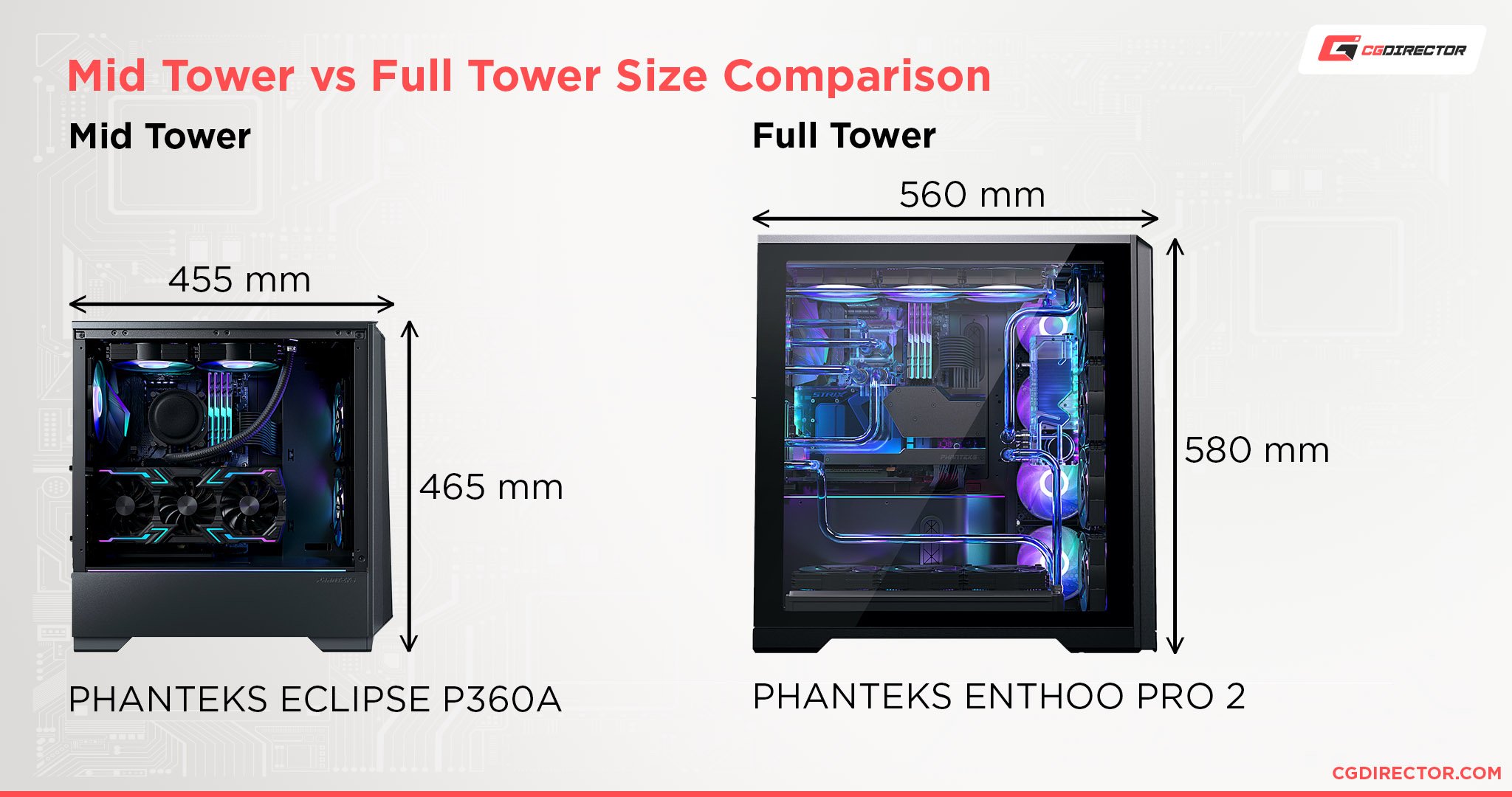
This is great for those with such priorities, but it does make for a larger, heavier, and more expensive chassis than the alternatives.
Mid Tower CasesA Mid Tower PC case will usually be under 20 inches tall (< 50cm), and closer to 17 inches (43cm).
Generally, this means room for 4+ 3.5-inch drive bays, at least 3 intake fans, and expansion slots to match a standard ATX motherboard.
While Mid Towers are reasonably smaller than Full Towers, they are still pretty big when compared to smaller form factors and today’s ever-shrinking consumer PCs.
A rare few are also capable of dual-PC builds but expect to go all-out on cooling fans or liquid cooling if you do that in a Mid Tower case.
While Mid Tower cases show some compromises compared to Full Towers, these compromises should mean almost nothing to the majority of consumers.
If you aren’t using all of your expansion slots or more than one hard drive, even Mid Tower might be slightly exaggerated for your needs.
What a Mid Tower does best, however, is keep the spirit of PC upgradability alive. even if you aren’t using multi-drive or multi-card setups today, a Mid Tower gives you the ability to move up should you ever want or need to change your mind. Additionally, Mid Tower cases do not have to deal with as many limitations as smaller form factors when it comes to keeping the hardware cool.
If you want great airflow and good expansion capabilities for cheaper than Full Tower, Mid Tower is a great choice. We’ll break down more of the specifics below.
Why A Mid Tower Case Is Best Great Drive StorageMid Towers usually offer 3-4 3.5-inch drive bays, as well as 3-4 2.5-inch bays to match.
This is more than enough for having multiple HDDs, multiple SSDs, or even both in a single PC.
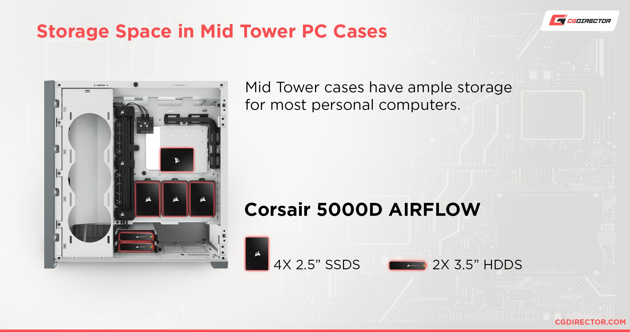
For consumers and gamers, this should be more than enough room for the ideal internal storage setup.
For the highest-end storage setups (especially for servers), though, this still might not be enough.
Majority of Cooling Options Work WellWant a fully air-cooled PC ? A Mid Tower case will be one of your leading options, especially if you want to maximize airflow.
While Full Tower cases are also great in this regard, a Mid Tower cases’ smaller footprint makes it just a little bit easier to push air through them. It’s pretty easy to get a good positive pressure airflow setup inside a Mid Tower case, especially when compared to a smaller chassis.
Liquid cooling setups work well here too, whether you’re using an AIO or a custom loop setup. While you can technically even get custom water loops running in a Mini ITX build, it’s a headache.
Mid Tower cases have much more room to work within comparison and are also compatible with larger AIOs/radiators than a smaller chassis would be.
2+ GPUs or Expansion CardsEspecially with modern GPUs, the majority of users aren’t using multi-GPU setups .
Even gamers, who used to love that kind of thing, have largely been turned off of multi-GPU setups by the dwindling number of games that actually support using more than one GPU at a time.
For professionals , however, even just one more GPU can make a significant difference in render times.
Most people would be better served by a single, powerful GPU that meets their needs, though- especially in today’s era of chip shortages.
Size & Weight Reined In Comparison To Full TowerLast but not least, the most obvious point: Mid Tower cases are smaller and lighter than Full Tower cases.
If you’re going to need to move your PC with any kind of regularity, it’ll be considerably easier to do that with a Mid Tower or smaller case than with a hulking Full Tower chassis.
Additionally, the cost of raw materials tends to drive up the cost of a Full Tower compared to a Mid Tower- you can save some money by going for a Mid Tower instead.
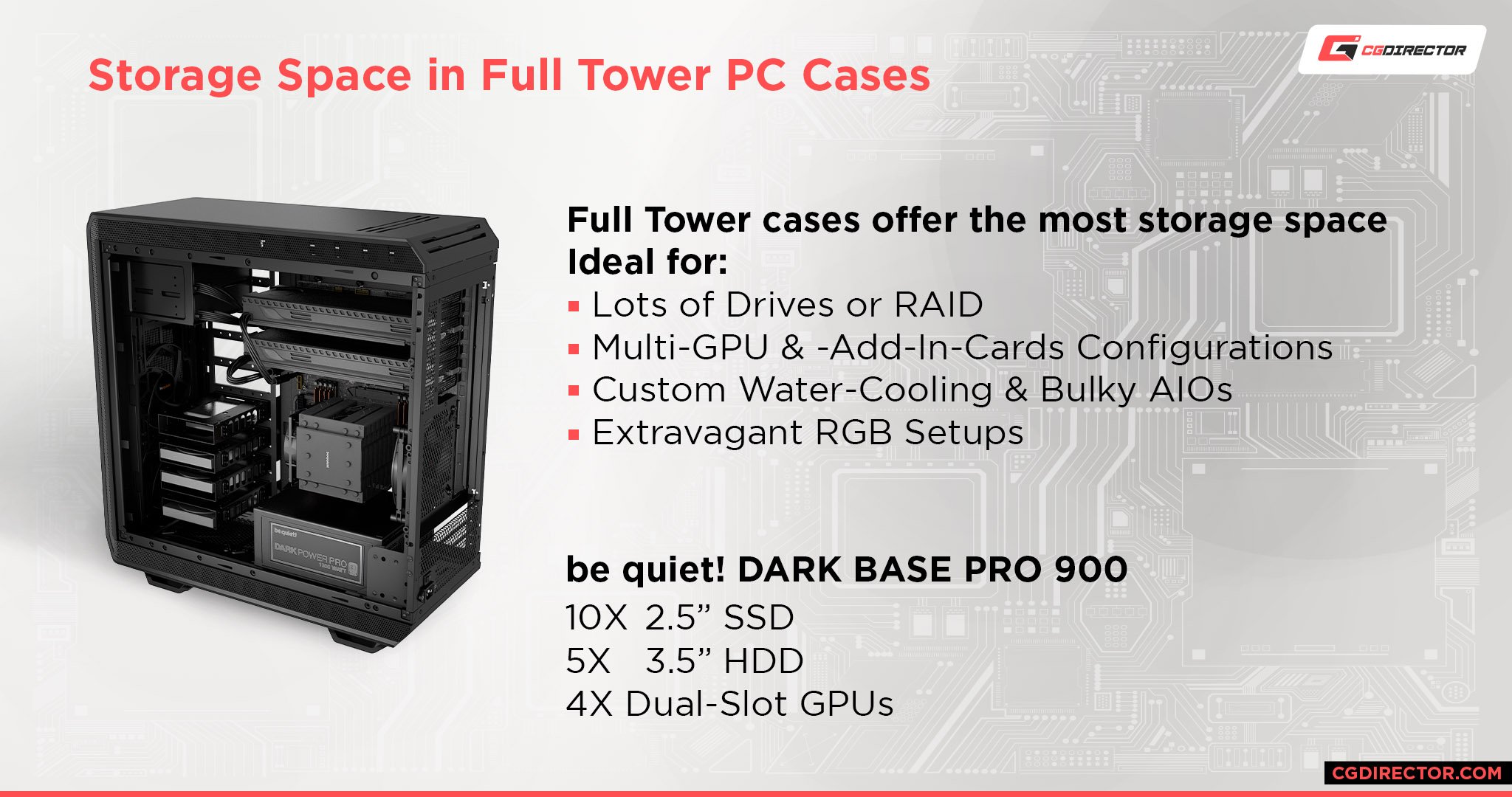
Why A Full Tower Is Best The Most Drive StorageIf you’re sure you want a higher-end multi-drive setup, then a Full Tower case should catch your eye. Especially if you’re trying to build a server, having 5 or more 3.5-inch bays at your disposal will come in handy.
5.25 bays for disc drives and card readers have become incredibly rare on the PC market, but if you’re looking for those you’re most likely to find them in a Full Tower as well.
If you want scalable, RAIDable, and stackable storage for the foreseeable future, a Full Tower case is a great option.
Best For High-End CoolingIf you want to have a high-end cooling setup with a large radiator or two (AIO or custom loop), then a Full Tower case is what you should be looking at. Especially if you want to do something extreme, like custom loop cool your CPU and more than one GPU, a Full Tower case presents itself as the ideal option.
Regular air cooling can still be extremely good in a Full Tower case, but you’ll also need to buy more case fans than with Mid Tower to keep air flowing throughout the whole case and not build up hot pockets in areas.
3+ GPUs or Expansion CardsMulti-GPU setups may not be as popular as they once were, but for the discerning enthusiast or professional who demands them , a Full Tower case is the best – and often, the only – choice.
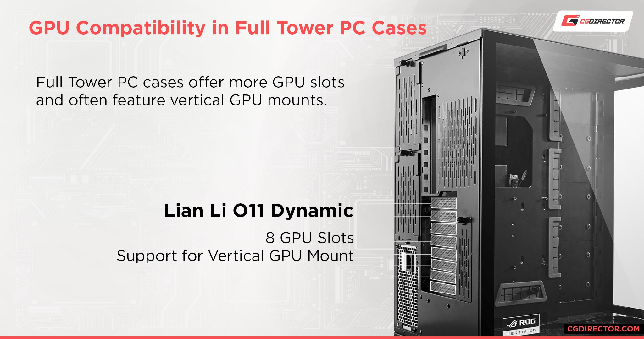
At this point, we’d just like to make sure that you know when to choose a blower-style graphics card over an open-air graphics card since blowers are generally much better in multi-GPU setups than their counterparts.
Dual-PC Builds Possible With Some Full TowersWhile a few Mid Towers out there have dual PC build configurations, most cases that offer this feature are Full Tower or larger.
Now, even some of the pros among you might be asking: why would I want to put 2 PCs into a single chassis ? Similar to the multi-GPU point, it really does depend on what kind of tasks you’re doing and how scalable they are across multiple processors.
Many pro applications support putting 2 or more PCs on a network onto the same task simultaneously , for instance.
Meanwhile, content creators (especially gamers who live-stream) can make great use of a chassis like this.
Your typical dual PC case will offer your standard ATX or Extended ATX PC build but include the option to mount an additional Mini ITX motherboard somewhere else inside the case, usually at the top or bottom.
In these cases, you can spend less on the ITX PC and dedicate it fully to streaming or rendering your video without interrupting your gaming or editing workload on your main PC.
If you opt for something like this, though, you’ll definitely want to consider amping up your cooling as much as possible. The secondary PC may not generate the same level of heat, but it will still be generating extra heat that your case needs to get rid of, somehow.
FAQ Are Mid Tower and Full Tower cases required for the best performance?Not necessarily.
While a Mid Tower case is roughly the best for raw airflow and you can maximize liquid cooling’s potential with a Full Tower case, you can still do pretty well with smaller form factors.
What’s important if you still want great performance in a small form factor is knowing how to optimize around it.
For instance, did you know that blower-style GPUs are the best for SFF PC builds? This is because standard open-air designs exhaust heat into the rest of the case, and generally are more reliant on strong airflow than blower-style cards are.
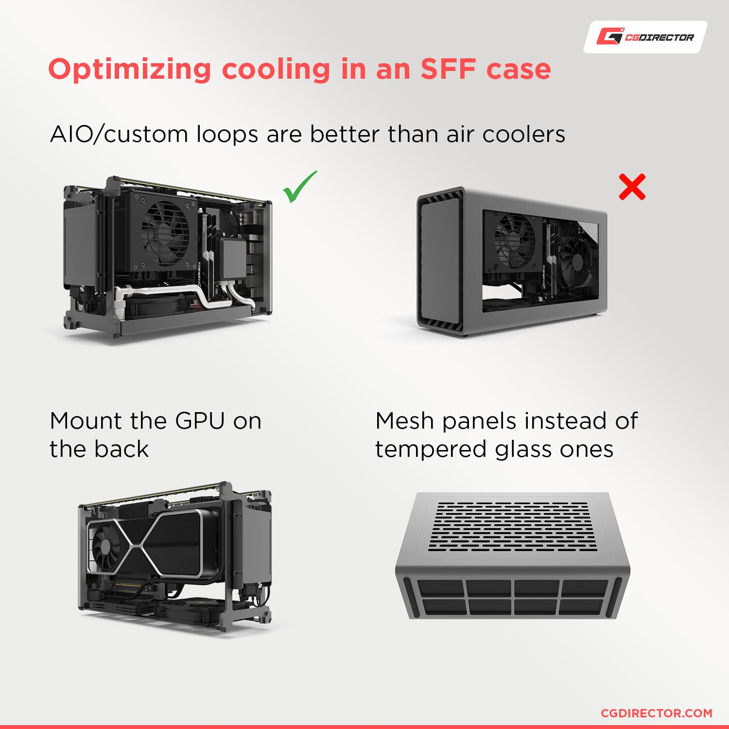
Custom loops and AIOs tend to perform well in SFF builds too, but they are still limited by fewer fan slots for mounting radiators .
It’s also generally more difficult to build inside of an SFF case, especially when you’re going as far as doing a custom loop.
Are Mid-Towers good for gaming?Absolutely.
If your only concern is gaming, then you most likely don’t need a Full Tower case. But if you want a multi-slot GPU with an open-air cooler, a Mid Tower case with a decked-out fan configuration is probably going to be your best bet.
Liquid cooling your components for overclocking will work great in a Mid Tower case, too!
When should I consider a Micro ATX or Mini ITX case instead of a Full or Mid Tower?Finally, let’s just be real: when should you downsize from the main form factors talked about in this article?
Well, if you don’t need a lot of drives or GPUs, chances are a Micro ATX case should serve you fairly well.
If you want to maximize your space-saving and you’re confident that you can build and maintain it, you can even go for a Mini ITX or other SFF PC build, but don’t expect everything to work well or even fit into your case at that point.
If you still want the benefits of a Mid Tower case but want something with a smaller footprint, check out our article on the best small ATX cases .
These aren’t quite SFF but they are generally much more workable than your standard Mid Tower or Full Tower designs, and you won’t sacrifice nearly as much using one of those as you would with Micro ATX or Mini ITX.
Over to YouAnd that’s it, for now!
We hope that this article taught you everything you needed to know to choose between these two distinct form factors.
Let us know in the comments below or in our forum : what are your experiences with a Mid Tower or Full Tower case? Do you have any questions we didn’t touch upon in this article? Are you tired of every case and motherboard manufacturer having a different definition for what Extended ATX is?
CGDirector is Reader-supported. When you buy through our links, we may earn an affiliate commission . More Articles from CGDirector
I have been a passionate devotee to technology since the age of 3, and to writing since before I even finished high school.
These passions have since combined into a living in my adulthood and have made writing about PC Hardware very satisfying.
If you need any assistance, leave a comment below: it’s what I’m here for.
2 Comments
8 November, 2021
Hi Christopher,
Cpu-5950x
Gpu- Rtx A5000
Ram-G.skill Trident z neo 3600-cl16(32×2=64Gb)
Storage- samsung 980pro 2TB
Mother board- Asus X570Dark hero
1.What pc cabinet would you recommend?
Fractal design meshify 2 or Corsair 5000D Air flow?
2.What power supply would you recommend?
Corsair Rm850x or Nzxt C850
I’m actually very new to PC building and any suggestion is much appreciated,
12 November, 2021
Hey Vijay,
I like all of your suggestions. The PSU picks and case picks are very similar. I’d probably go with the Corsair PSU and the meshify 2, as both of these are products that have been on the market for quite some time and are known to be reliable.
Cheers,
Alex